COMPELLING VISUAL
COMMUNICATION
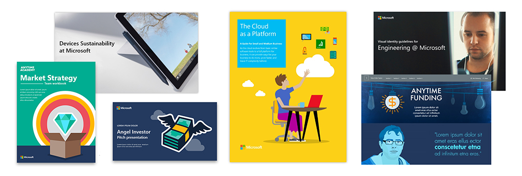
Visual identity creates an immediate emotional connection between your audience and your content. It sets the context for your brand strategy and communication objectives, and it brings detailed information to life. At MediaPlant, we specialize in developing visual elements that align with your business goals, bringing forward elements from an established brand in unique and unexpected ways, or working from a blank slate to build exactly the right look for your needs.
Every aspect of the site, from the visual identity to the UX to the feature set, works together to tell a unified story.
Telling a visual story
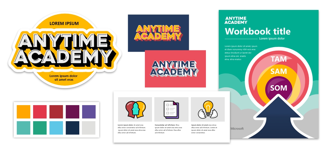
Multi-faceted campaign collateral: Microsoft’s Anytime Funding is an incubator program that enables employees to pitch new products to senior leadership and earn project funding if their idea is accepted. It’s an exciting program and a unique opportunity within Microsoft, so their visual identity needed to reflect those qualities and promote an innovation mindset within the company.
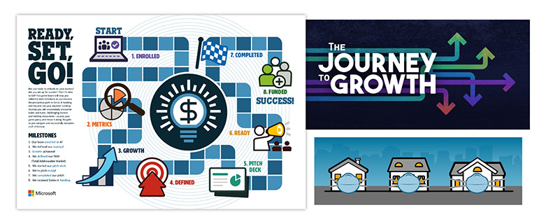
MediaPlant developed a dynamic visual style, pushing the boundaries of the Microsoft brand to deliver attention-grabbing graphics and compelling collateral to capture interest and maintain enthusiasm. Featured content includes team mission statements, pitch decks, ebook templates, discussion guides, member spotlights, and project “snapshots”, as well as a podcast program and an ongoing series of virtual meetups. We also created fun motivational tools for the Anytime Funding teams, including a retro-styled game board that allows them to track their progress through key project milestones.
Every aspect of this campaign, from the visual identity to the site UX to the feature set, works together to underscore the fun, competitive and edgy elements of entrepreneurship, while elegantly meeting the needs of the team and the users.
VISUAL BRAND BUILDING
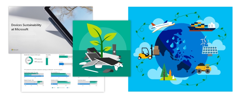
Comprehensive annual report: Every year, Microsoft invests significant resources in sustainable business practices, then documents those efforts in a deluxe annual report focused on compliance and corporate responsibility. Though this report contains detailed information about the company’s achievements and metrics, the larger brand communication goal is to reassure stakeholders that Microsoft is on the right side of important issues and backs up its intentions with tangible initiatives.
We deployed visual components for maximum impact: a branded color palette with a pleasing range of blues and greens to suggest unspoiled natural settings; illustrations that command attention while reinforcing the high-level story with visual metaphor; complex data condensed into appealing, easy-to-read infographics. Navigation within the report is intuitively easy, enabling quick access to nested sub-sections of information dense content. The completed report is easy to consume and efficiently communicates key information without losing sight of necessary detail.
DESIGNING THE RIGHT IMPRESSION
Visual identity: Deciding the right place to start or extend your career is personal choice that often depends as much on gut instinct as on check-the-boxes rationality – even for engineers! When Engineering@Microsoft asked us to build a site to foster a sense of community among the disparate engineering groups within the company, we knew the visual style had to send the message that engineers were in the right place to
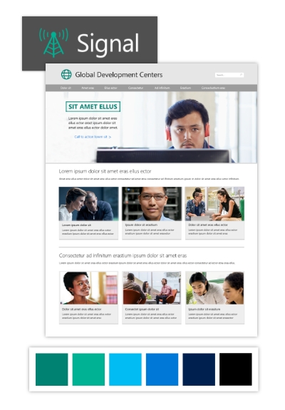 build their skills, build their careers, and transform the world.
MediaPlant worked with key stakeholders to determine and refine a global design aesthetic, and then created the visual identity—including color palettes, logos, type treatments, and sample executions for downstream materials—accompanied by a comprehensive style guide that provides usage guidelines for a wide range of scenarios. We took the Microsoft brand in a less-commonly used direction, choosing vibrant teal tones to set off the photographic imagery, suggesting a professional environment crackling with energy and vibrancy. We then developed an internal portal to act as communication hub for the group, designing it to be an engaging storytelling platform which can be quickly and easily updated by the communications team.
MAKING CONTENT SHINE
Illustrated eBooks: People process visual content 60,000x faster than text. We learn material more efficiently when it is presented visually, retain it longer, and can absorb more of it. That’s why, when Microsoft’s US subsidiary asked us to produce a series of thought-leadership pieces around the business value of cloud computing for small business, we chose a fun, graphic-heavy approach that distilled the key points into infographics and illustrations.
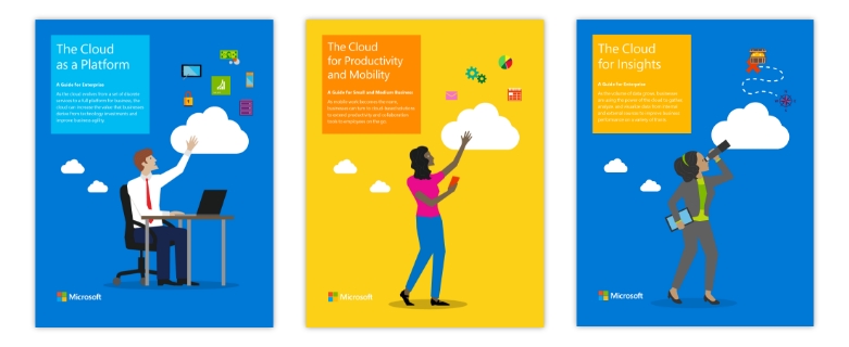
MediaPlant wrote and designed seven 12-page business value eBooks. Four were targeted at larger organizations, with language and storytelling relevant to Enterprise business decision makers (BDMs), and three were targeted at small to medium-sized businesses, written with individual business owners and small business BDMs in mind. We fully designed and illustrated each eBook with custom infographics based on the brand illustration style, and added unique visual elements for each specific audience. The results were memorable, high-impact marketing tools that made a great impression on customers and field sales teams.

Are you ready to better connect with your audience?
We’ll help you tailor communication to them, whether that means crafting the right message to make an impact, making creative design choices that resonate, or using the right medium to engage end-users.
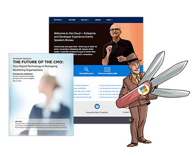
AUDIENCE-TAILORED COMMUNICATION
Are you missing the mark with your customers? Learn how MediaPlant can help you connect and engage through audience-specific content, user-friendly design, and technical solutions that work the way your team works.
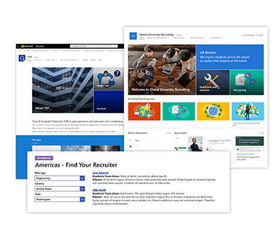
DIGITAL TOOLS FOR COLLABORATION
Are you using the right tools to communicate and collaborate with your team? Learn how our custom solutions, from internal portals to online training courses, help you and your team work more efficiently.

 Contact us